Strava · A closer look
Surfacing Value
Strava’s navigation, reorganized around what athletes came to do
I facilitated the cross-functional sprint that redesigned Strava’s navigation, so athletes could find what they came for, including the features worth paying for.
- My role
- Facilitator and design leader
- Worked with
- Revenue, research, product, data and engineering, plus a fellow design lead who owned the design and architecture, and our VP of Design as sponsor
- What I did
- Pushed for the sprint, ran it, set design direction, and got leaders behind one plan
84% of subscribers said they understood what had changed, and the experiment showed a net gain in bookings after counting downgrades.
The situation
Strava’s navigation had started to show what I call experience rot. Years of new features, experiments and tests had pushed core features, paid ones included, deeper into the app, and the value of a subscription got harder to see.
At the time, tens of millions of athletes used Strava every month, so small changes moved big numbers. Leaders wanted it fixed and were wary of breaking what worked. They asked for three things:
- Protect what’s working. Engagement, uploads and subscriptions couldn’t dip.
- Make it buildable. A prototype simple enough to plan development from.
- Explain the why. A clear point of view on why each change was worth making.
My role
I made the case for a cross-org design sprint and ran it, bringing revenue, research, product, data and engineering to one table. A fellow design lead owned the design and architecture, and our VP of Design sponsored the work. My job was alignment: getting leaders who each owned part of the app to agree on one structure, and keeping the athlete at the center while they did. One participant called it “the best meeting I’ve ever been in.”
How I approached it
-
Organize around jobs, not the org chart
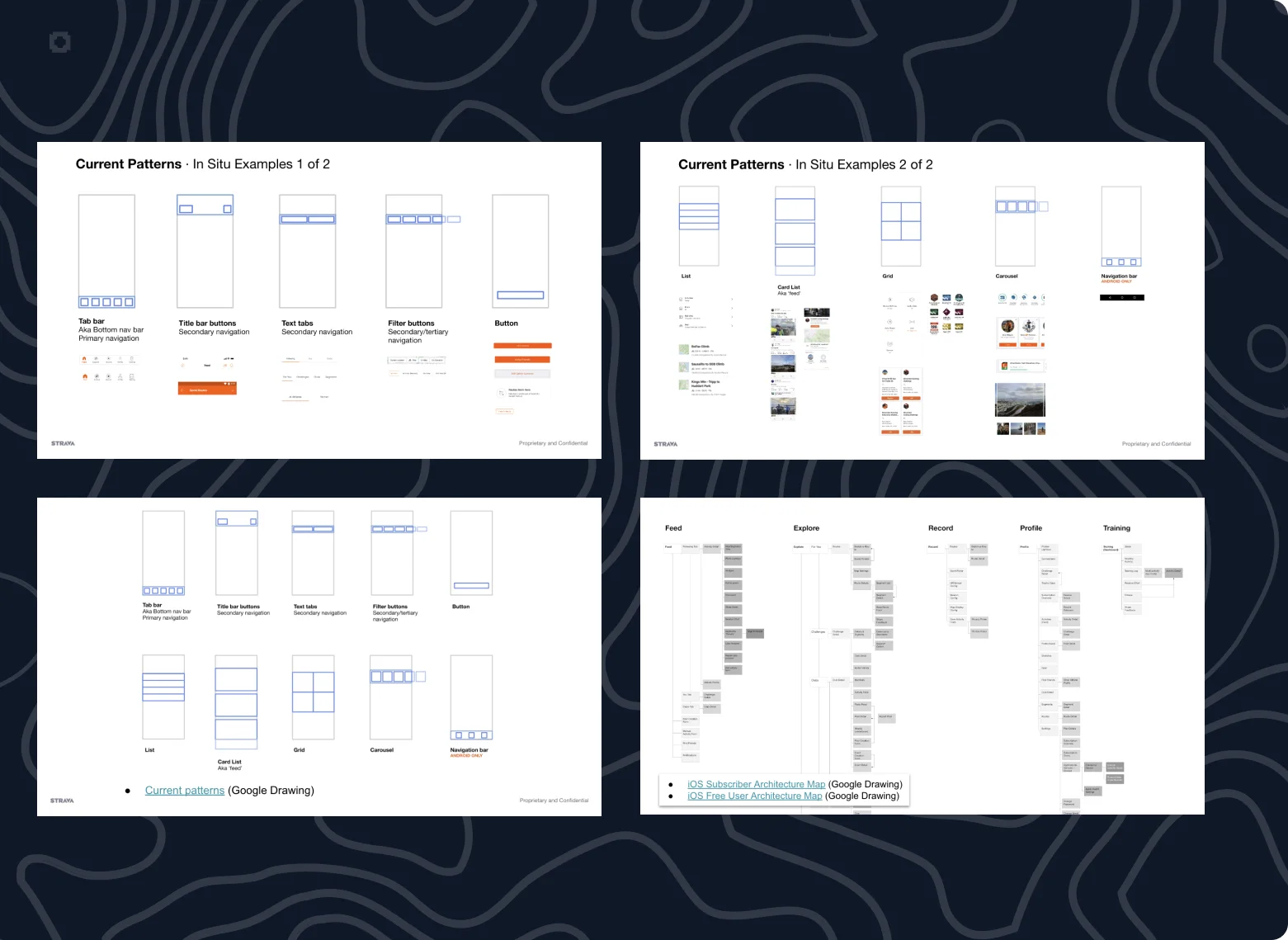
Before we drew a single tab, we mapped every navigation pattern in the app and found the deep ends where valuable features were hiding, like maps and profiles. Then we grouped features by what athletes come to Strava to do, using the analytics as jobs to be done rather than by which team owned which screen.
-
Let athletes sort it
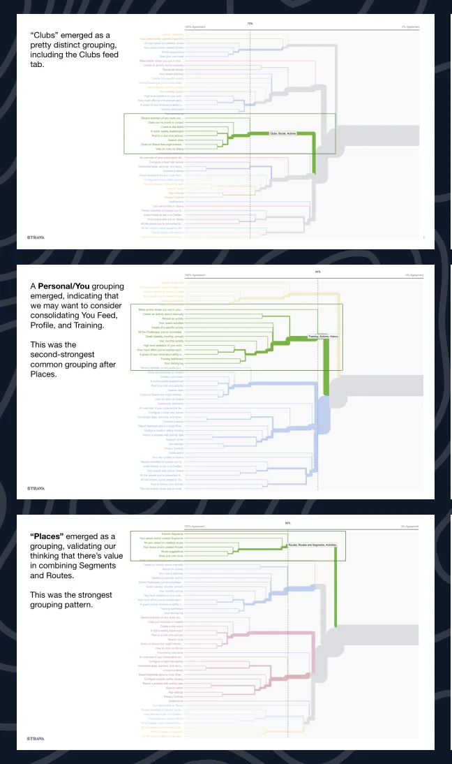
Fourteen athlete interviews and a card sort with 30 athletes showed three areas people already understood: places, community, and their own activities and progress. Those became the backbone of the new navigation.
-
Test a step against a leap
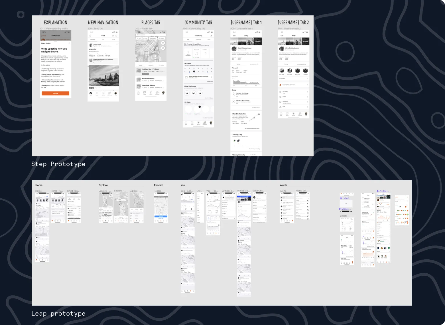
We built two prototypes. Step moved existing features to where athletes expected them, without huge moves. Leap was a drastic departure, with new features and a new structure. We wanted to know whether athletes wanted new functionality or the features they already had, better placed. Step won.
-
Explain the change inside the app
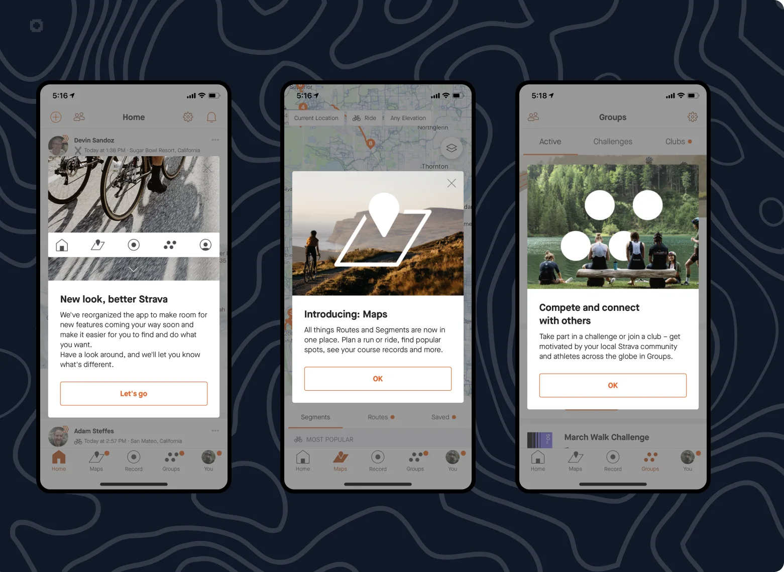
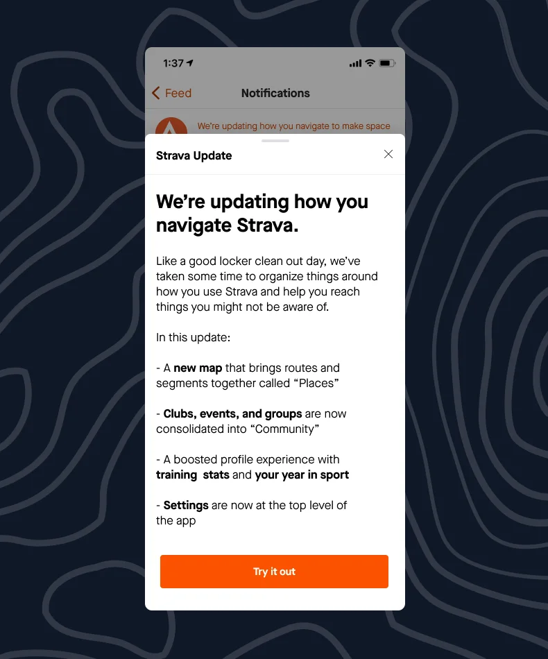
Testing showed that how we explained the why made all the difference. A new navigation can feel like someone moved your furniture, so a short introduction walked athletes through what moved and why, and the redesign read as an upgrade, not a surprise.
-
Ship it as an experiment
We launched to a test group and watched what could break as closely as what could improve, subscriptions included, so the result we reported was the net effect.
What shipped
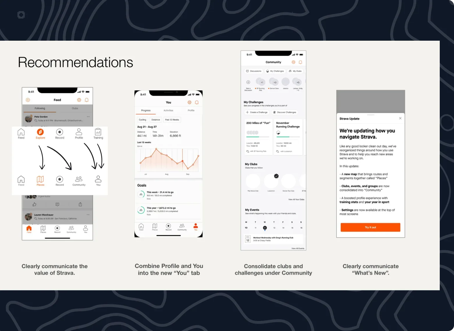
The structure athletes sorted for themselves shipped as Maps, Groups and You. Maps brought routes and segments together, Groups gathered clubs and challenges, and the You tab brought profile and progress into one place. An in-app introduction explained each change the first time an athlete saw it.
What changed
Within a quarter, the new navigation had proved itself. The gains were small and uneven, and they pointed the right way: athletes used core features a little more, and paid features more overall. The feedback had a couple of dings, on Maps and Groups, and they confirmed features we’d already planned.
It also gave the team the confidence to keep investing in maps and community, and a designer on my team went on to lead a Settings overhaul built on the same thinking.
What I learned
- How you explain a change matters as much as the change.
- Isolate the downgrade signal before calling the win.
- Better UX is easy to credit, and easy to blame.