SuppCo · A closer look
StackScore
SuppCo’s signature score, redesigned to explain itself
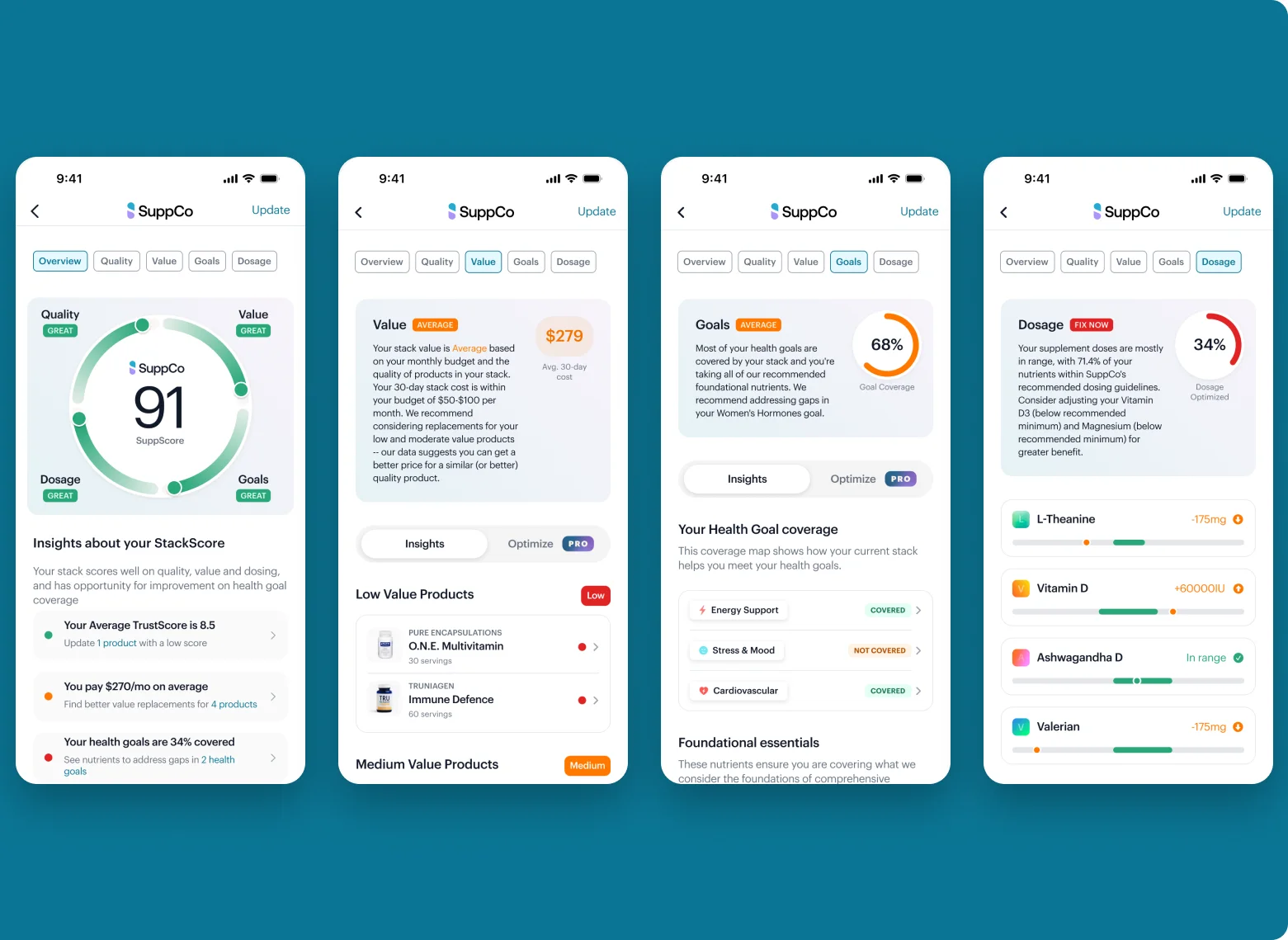
I redesigned SuppCo’s signature score into a hub that explains itself, breaking one AI-written verdict into four sub-scores that each lead to a next step.
- My role
- Designer, from the first framing through launch and a year of iteration
- Worked with
- Product and engineering, who owned the scoring logic
- What I designed
- The four sub-scores, the ring, the Insights and Optimize pattern on every tab, and the update flow
After launch, an update prompt raised score updates by about a quarter for free and Pro members.
The situation
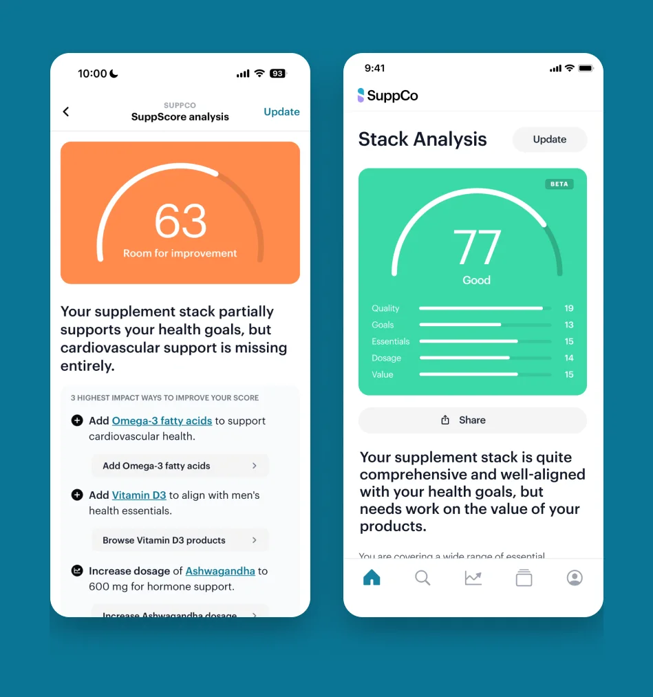
The score was why people downloaded SuppCo, yet it was a single number and a long, AI-written report about your supplement stack.
The score moved for reasons no one could see, and when members followed our advice, they didn’t always understand why it changed. It came up again and again in member feedback.
My role
I designed StackScore from the first framing through launch and a year of iteration. Product and engineering owned the scoring logic; I owned how the score looked, read and behaved, and what it asked members to do next.
How I approached it
-
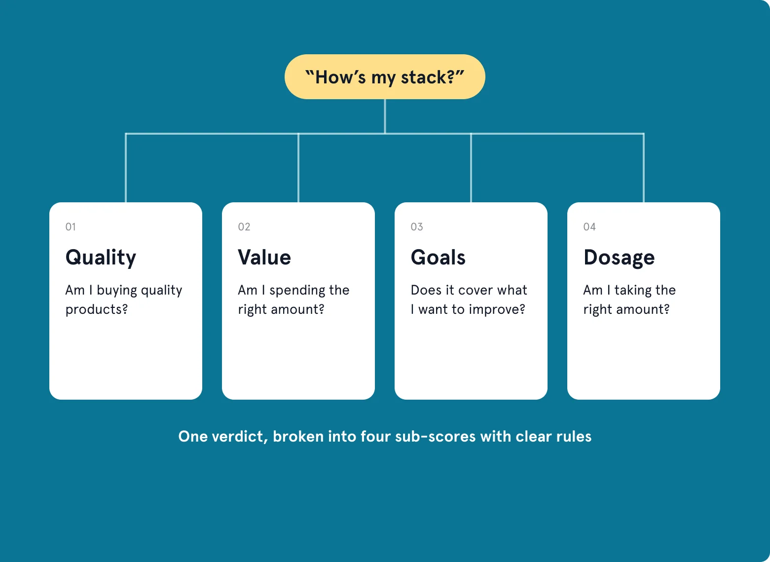
Four questions, not one verdict
I broke “How’s my stack?” into the four questions people actually ask: Am I buying quality? Spending well? Covering my goals? Taking the right amount? It also showed the score for what it was: a calculation that moves with your stack, not something ambiguously AI-generated.
-
Find the ring
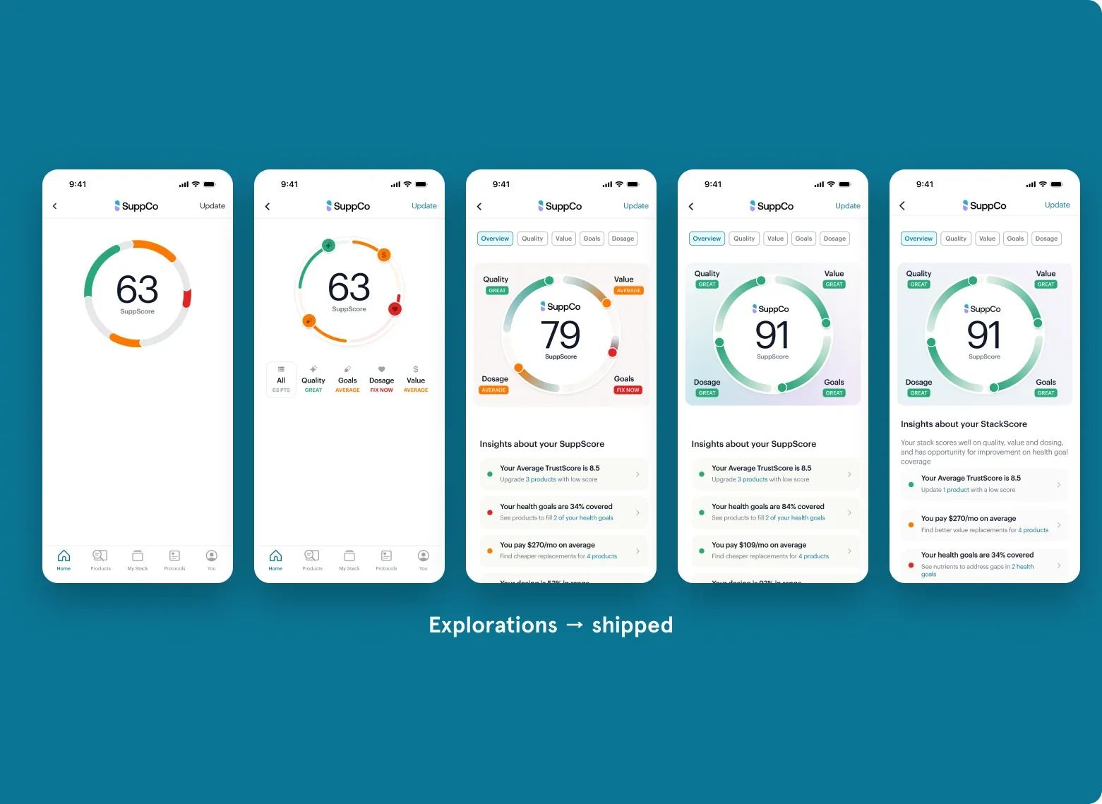
Four sub-scores couldn’t bury the one number people came for. I tried bars, petals, stacked arcs and color fields, with Apple Watch faces as inspiration. One ring with four segments won: the score stays the hero, and each segment shows at a glance where you’re strong and what to fix.
-
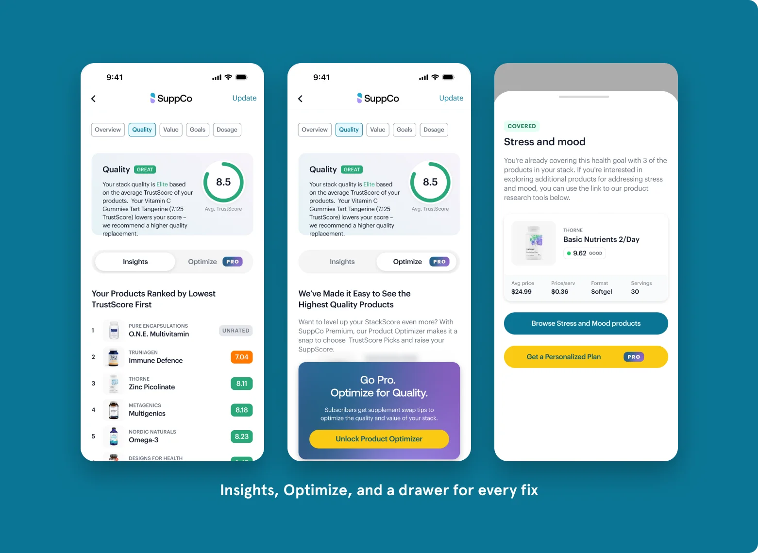
Every score earns an action
A score without a next step is a dead end. Each tab pairs Insights (why you got this score) with Optimize (what to do about it): swap a low-quality product, find better value, fill a goal gap, fix a dose. Optimize also became the natural home for Pro tools.
-
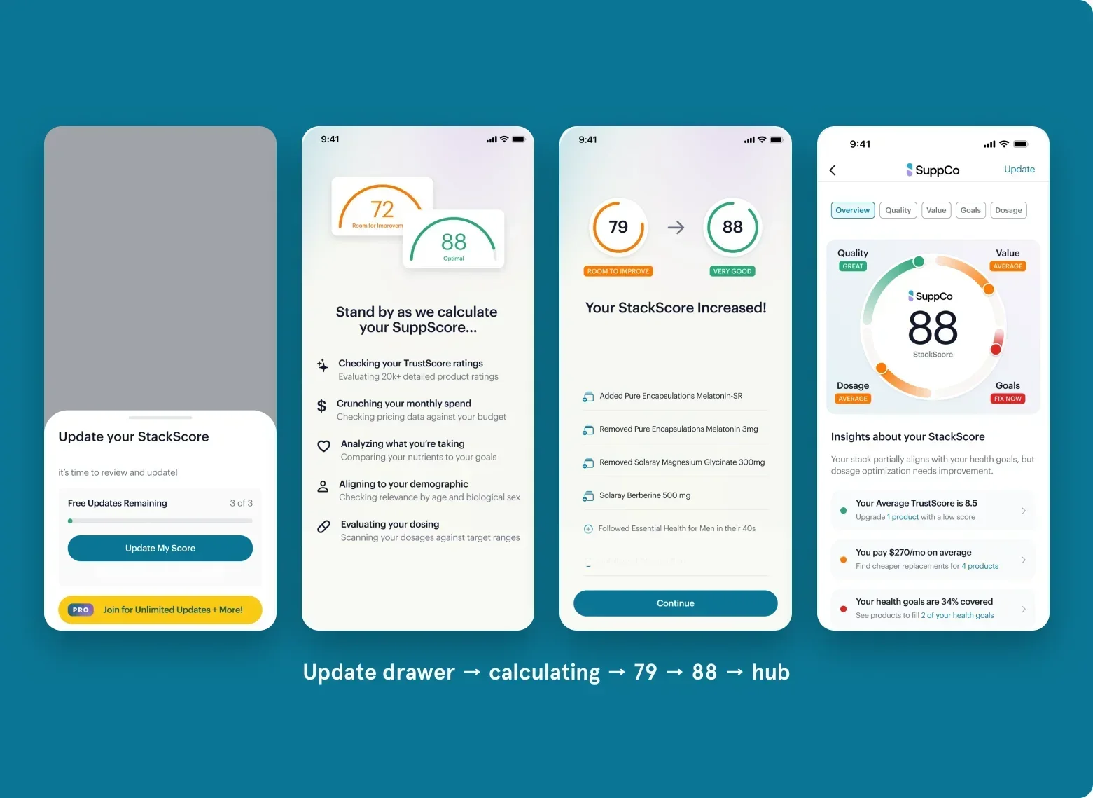
Make the update a moment
Scores went stale because updating was invisible. I modeled the update on a credit report: a short calculation, a from-to reveal, and a log of what changed. Monthly emails brought people back for a new score, even when they hadn’t opened the app.
What changed
After launch, the new update prompt raised score updates by about a quarter for both free and Pro members, and StackScore became one of SuppCo’s most established engagement loops.
It didn’t fix everything. New members still needed a faster path to their first score.
A related experiment: call and response
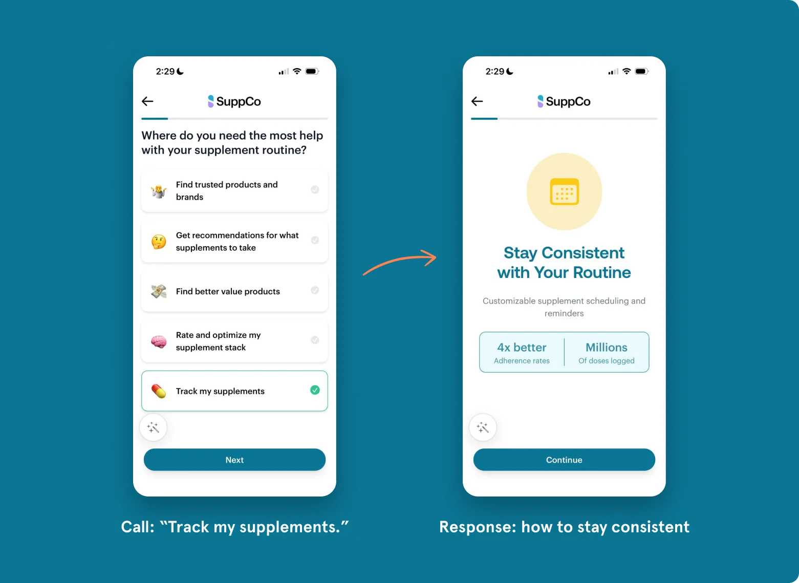
SuppCo’s onboarding asked new members about their goals, age, budget and stack without saying what they’d get back. My concept was to treat every question as a call that earns a response: answer, and SuppCo answers back with a small, specific fact about you or people like you, proof of value before the paywall instead of a pitch.
Onboarding was about to change again, so I built it to test, not to keep. One template (an icon, a headline, two proof points) turned every new response into copy and data rather than new screens, and we shipped it as an A/B test. It moved activation, not monetization: more new members committed their stack, which the rest of SuppCo builds on, but it didn’t sell Pro on its own.
What I learned
- Watch for anything that slows the habit you’re trying to build.
- A score needs reasons and a next step.
- Build experiments to be replaced.