Strava · A closer look
Designing for Trust
Strava’s privacy controls after the Heatmap
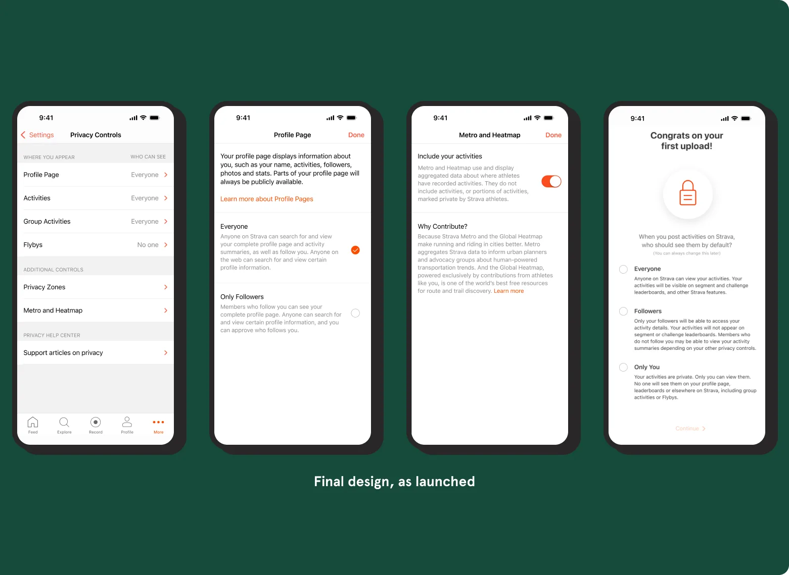
I redesigned Strava’s privacy controls so athletes could see, and choose, what they share.
- My role
- Hands-on design lead on the Trust team
- Worked with
- Product, engineering, legal and company leadership
- What I designed
- The controls, onboarding and launch communications, on mobile and web
After launch, more than a quarter of active athletes reviewed the new controls, and 27% of them changed a setting.
The situation
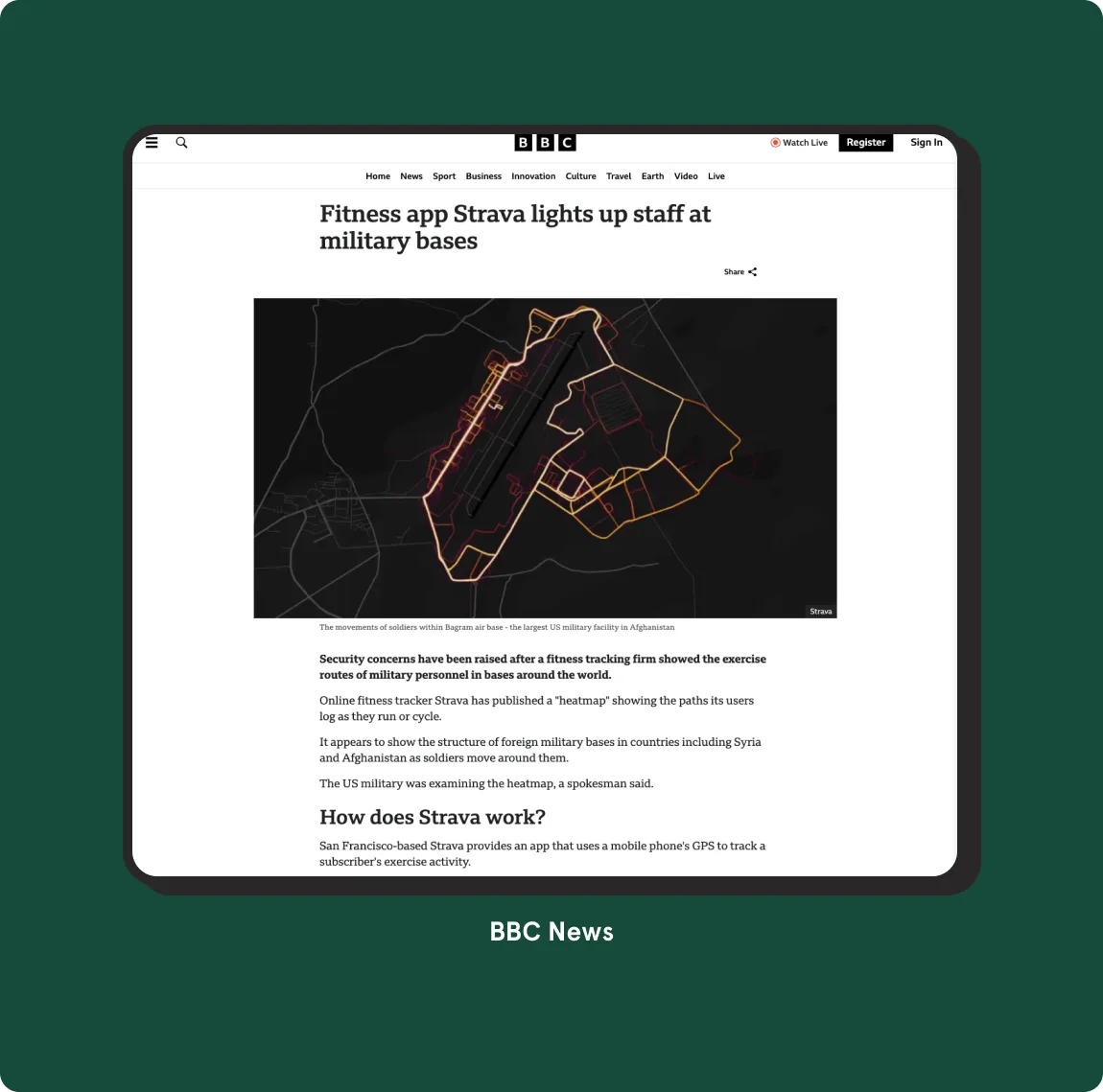
Strava’s Global Heatmap showed where people ran and rode, including on military bases, and the story went around the world. The question underneath was older: Strava had grown up public by default, and not every athlete wanted that.
- Public by default. New athletes started out sharing with everyone.
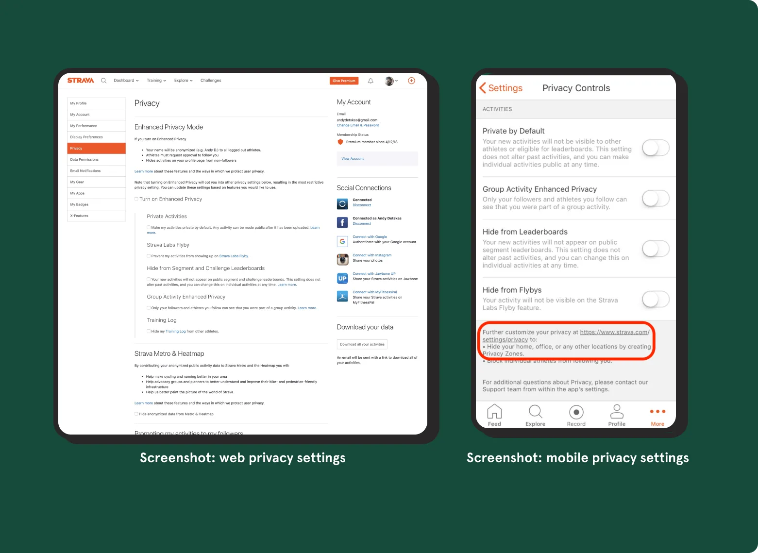
- Many entry points. Privacy settings lived in many places across mobile and web.
- An answer already in motion. A three-bucket design (Everyone, Followers, Only You) was underway when I joined.
My role
I joined Strava’s new Trust team as its design lead, about ten weeks after the Heatmap story. The team covered privacy, customer support and spam. I grounded the work in athlete research, then designed the controls, onboarding and launch communications with product, engineering, legal and company leadership. Along the way, I brought Privacy Zones to mobile.
How I approached it
-
Map every entry point
Privacy settings lived in many places across mobile and web. Before redesigning anything, I mapped every place an athlete met a privacy decision.
-
Put it in front of athletes early
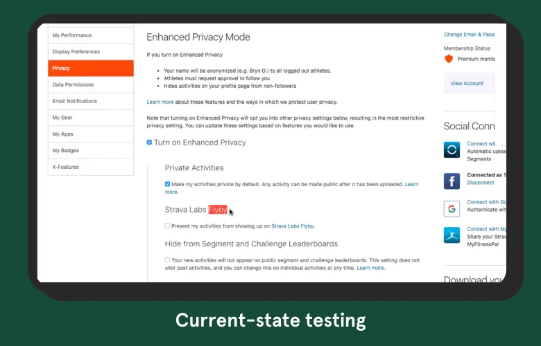
Before building on the three-bucket design, I tested the current settings and our early prototypes with athletes, and mapped every stakeholder I’d need to bring along.
-
Listen for what shuts people down
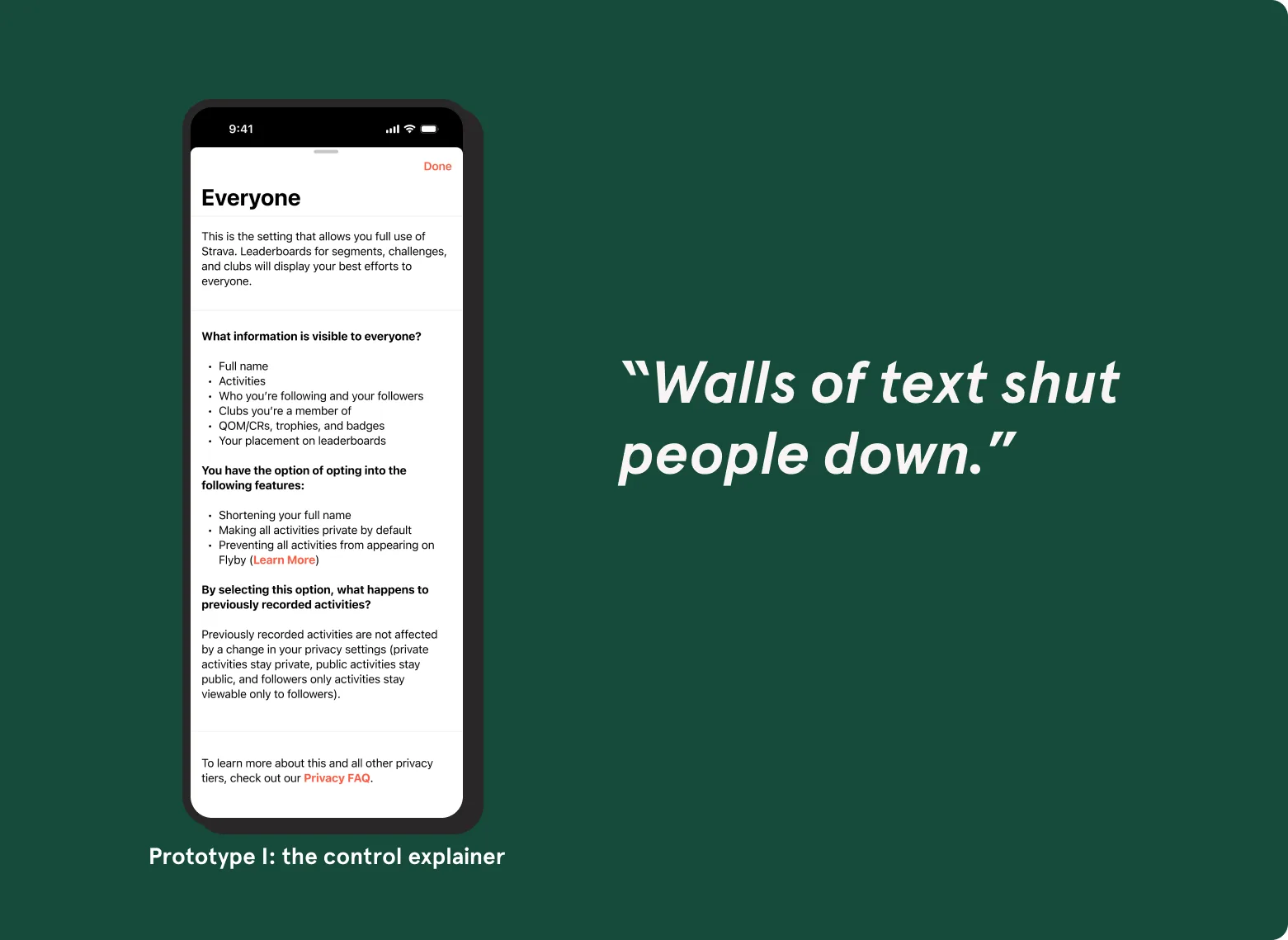
- Walls of text shut people down.
- Communicate clearly, but concisely.
- Let athletes set control at their own level of comfort.
- Comfort with sharing pattern-of-life data differed sharply between men and women.
-
Flexible, not rigid
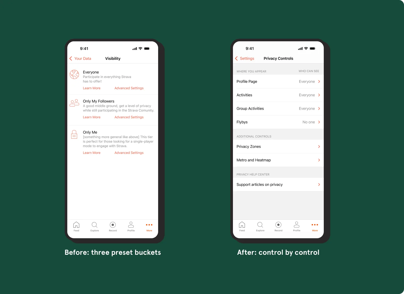
Three presets tied every setting together, so wanting more privacy in one place cost you something somewhere else. I made the case for a flexible schema, where each athlete sets each control at their own comfort level.
-
Plain language, one tap
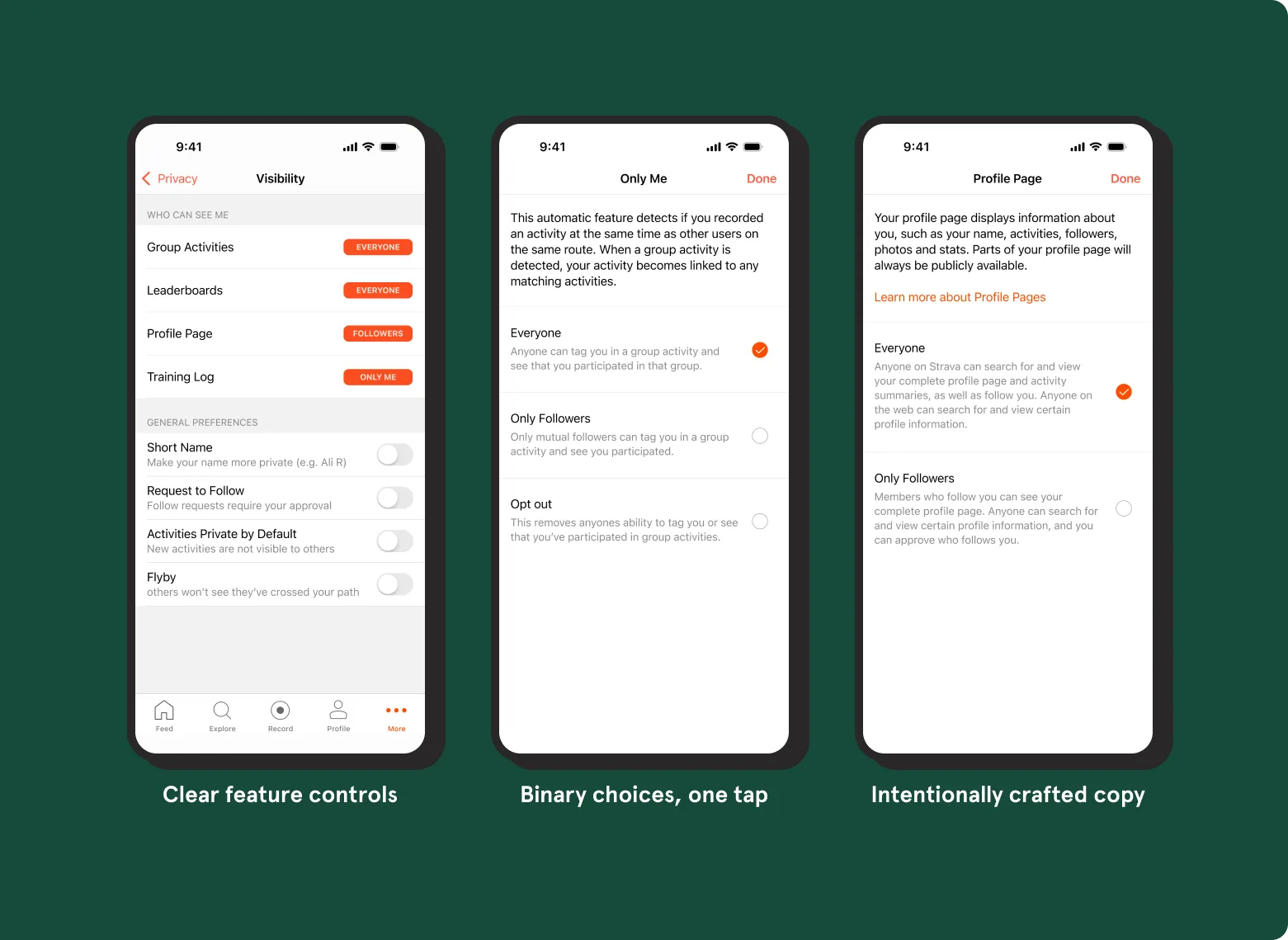
Feature-first controls, binary choices as a single tap, and explainers short enough that people actually read them.
-
Control everywhere it matters
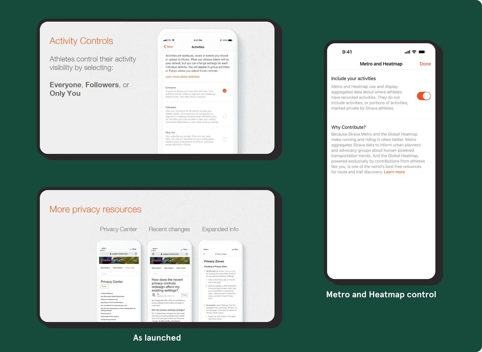
Profile, activities, group activities, flybys, privacy zones, and Metro and Heatmap, plus onboarding and per-activity settings.
Launch
We launched with every athlete’s existing settings carried over automatically, so nobody had to do anything to stay protected. Athletes heard about the change by email, in the app and on the blog, and a Privacy Center explained every control.
What came next
Transparency, consent and control carried into the rest of my Trust & Safety work: research on hiding where activities start and end, safer group activities, and Integrity Compass, a pre-launch review of inclusion, privacy and safety risks that I co-created with a design colleague at Strava. One session ran nine product teams through it.
What I learned
- Some research beats none.
- Launching isn’t leaving.
- Default settings are a values decision.
What I’d do differently: spend more time in person with the core team in San Francisco (I was in Denver), and push sooner to move the whole settings area higher in the app’s information architecture.