SRAM · A closer look
Crushing the Basics
Building a design function inside a hardware company, and re-centering the app on what riders needed most
At SRAM, I turned a UX team into a product design and research function, then used what we learned to re-center the AXS app on the basics riders needed most: battery, firmware and connection.
- My role
- UX manager for six product designers; strategy lead and facilitator
- Worked with
- Product management, app and firmware engineering, and senior leadership
- What I did
- Grew the team and its research practice, ran the strategy workshops, and proposed the app’s mission and primary KPI to leadership
I re-centered the app strategy on reliability (battery, firmware and connection) built on SRAM’s annual rider survey, community vote data and support tickets, and sharpened through 25 stakeholder interviews. It became the Digital Product Group’s plan for the year.
The situation
SRAM makes bike components, and its AXS app is how riders pair, update and check them. The app comes free with the hardware, so its real job is trust: is my bike ready to ride?
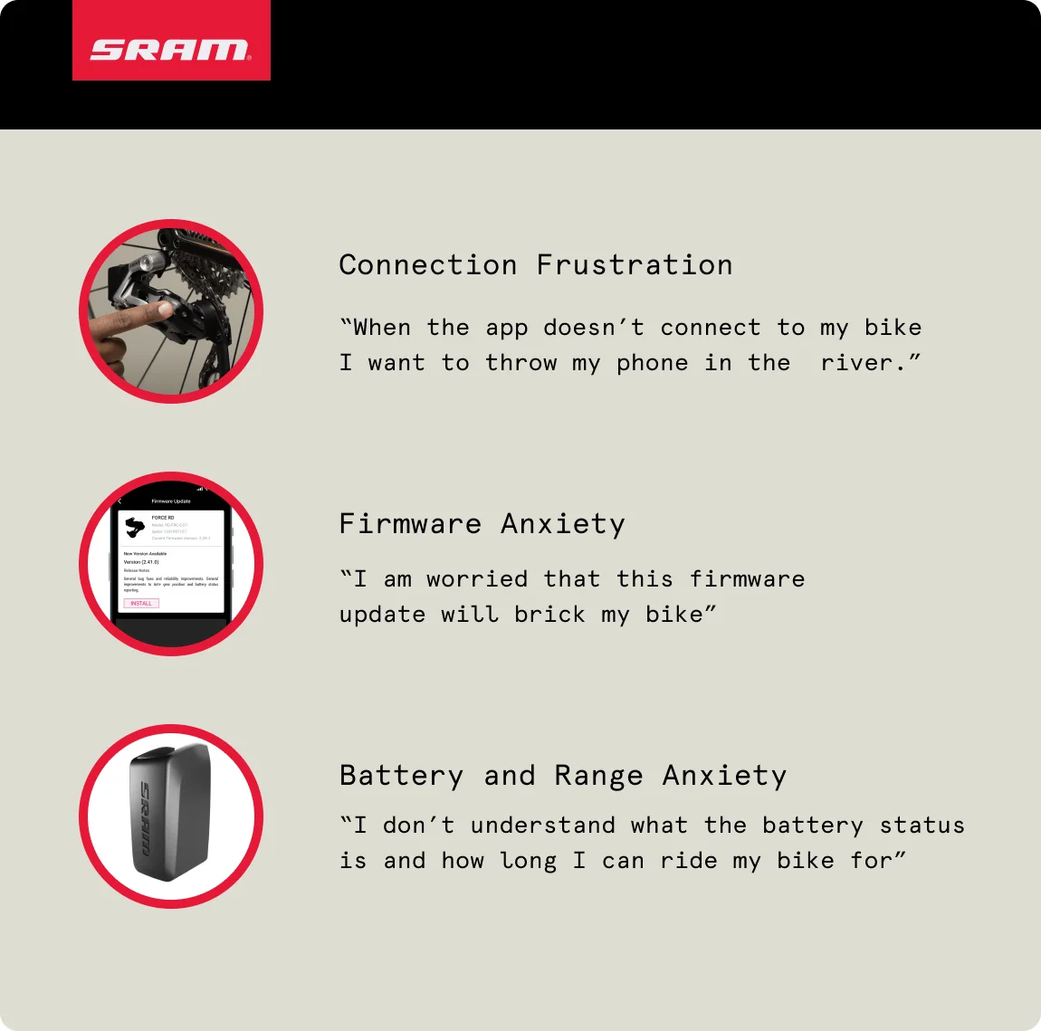
Research told us it wasn’t doing that job. Riders couldn’t tell how much battery they had left or how long they could ride, firmware updates felt like they might brick the bike, and the connection between phone and bike was unreliable. Those three things were the app’s whole reason to exist.
My role
As UX manager, I led six product designers across the AXS rider app, the web, and the tools used in factories and by dealers. I grew the team, built its research practice, and led this strategy with partners in product, engineering and firmware, through workshops, share-outs and facilitated discussions.
Growing the team
I hired three designers in my first six months. Then the team needed a shared picture of what growth looked like.
I adapted SRAM’s internal job-level format into career levels for product design: five levels, from Associate to Staff, and about twenty skills in four groups (core design, specialist skills, collaboration and strategy). Nobody has to be strong in everything. Each level says how many skills you’re strong in and how wide your scope is.
- Associate
- A product team
- Designer
- A product team and the design group
- Senior
- Several product teams
- Lead
- Product teams and other departments
- Staff
- The product group and the company
We used the levels in career conversations and promotion cases, and designers were promoted within the first year. From the team’s retro: “Stoked to have clarity around levels.”
How I approached it
-
Build the research habit
I set up a research practice the whole group could use: field testing with riders at events like Sea Otter, and a shared research repository in Dovetail that 73 people across product and engineering came to use.
-
Dump out all the Lego pieces
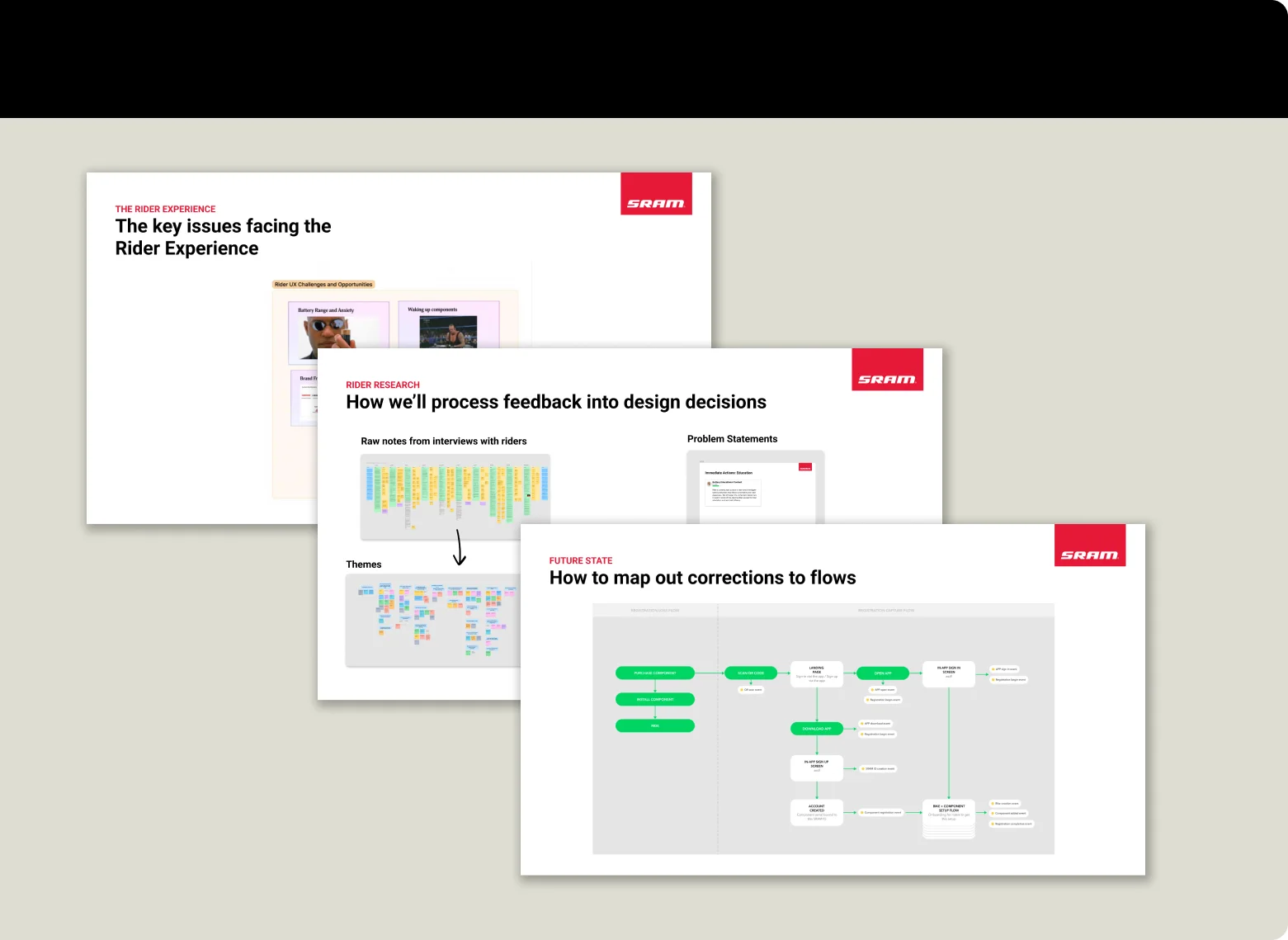
I pulled together the research we had and the research we still needed: SRAM’s annual rider survey, community vote data and support tickets first, then 25 stakeholder interviews I ran with my team as the strategy took shape. I shared it out with designers, stakeholders and leaders until we agreed on what needed attention first.
-
Agree on what the app is for
Sharing the research showed that we didn’t have a shared answer to what the app was for. I ran a Business Model Canvas workshop to agree on what the app is for today and what it could become, and proposed the app’s mission and its primary KPI, Ready to Ride, to senior leadership.
-
Give the strategy a name
I packaged the priorities as one strategy with a name people could repeat: Crush the Basics. Fix battery status, firmware updates and connection first, because nothing else in the app matters if those fail.
-
Map every problem by owner
Many of the fixes needed firmware or hardware teams, not just the app team. Mapping every problem by owner showed leaders what design could fix alone and what needed other teams, and prioritizing with the team set the order of the work.
Battery, the first basic
Battery status was the first basic we took on. Two designers on my team led the design; I set the direction, sponsored the work and coached them through the research.
My team discovered that riders believed in a yellow battery light that doesn’t exist. The light shows green, red or flashing red, but riders swore it turned yellow. They also rarely checked the battery in the app, and when a battery died on a ride, they blamed themselves. The team’s note was simple: we should make this responsibility ours. The gap between what the hardware said and what riders believed became the brief.
We put prototypes in front of riders in person at Sea Otter: short copy like “Charge now” against an estimated ride time, a simple list against one organized by battery type, and several approaches to color and icons.
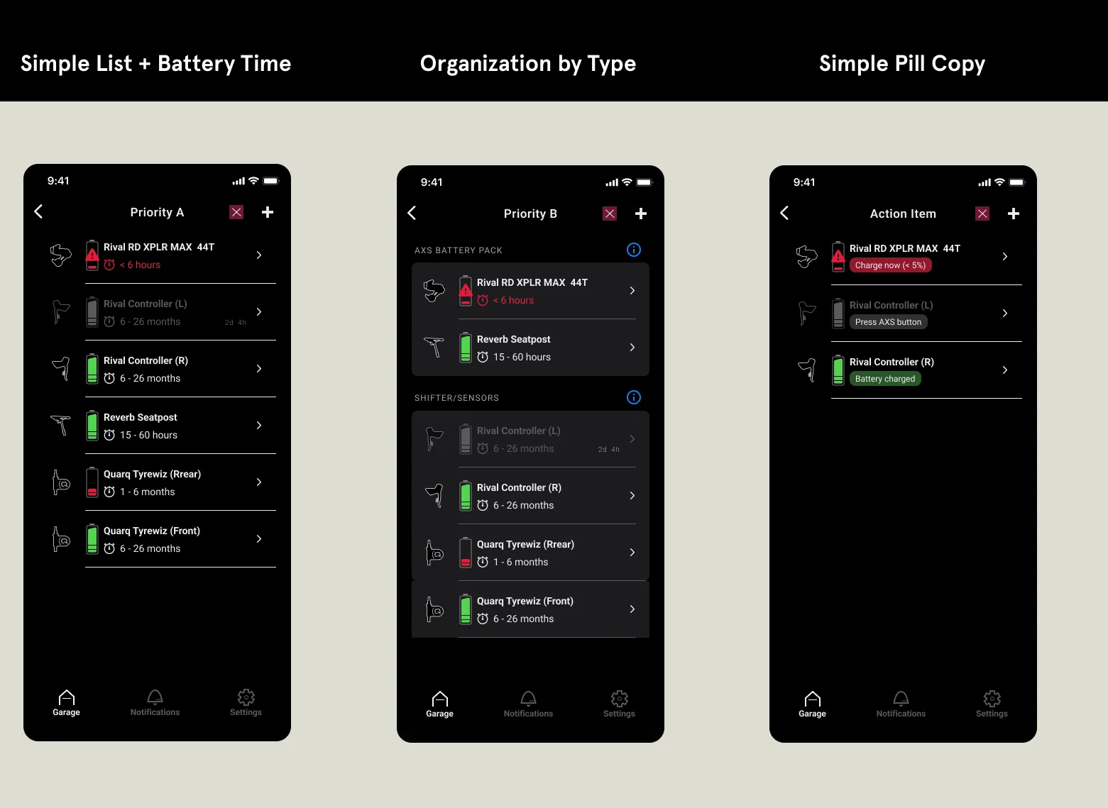
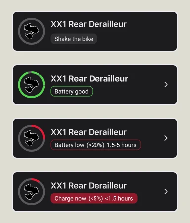
Riders preferred a screen grouped by battery type, the circle icon and its colors over other depictions, and an estimated ride time over a percentage. The team turned that into a full set of battery states for the design system: full, low, critical, disconnected and connecting.
The new battery status shipped after I left SRAM, so I don’t have its numbers. What I can show is the research, the decisions and the designers who made it.
What changed
Crush the Basics became the Digital Product Group’s plan for the year, and the team went on to treat battery, firmware and connection as core to the app rather than as bugs to get past. Most of the outcomes landed after I left, so I won’t claim them here.
What stayed with the team was the function: designers hired and growing, research that anyone in product and engineering could search, and a shared answer to what the app is for.
What I learned
- Give the strategy a name people can repeat.
- Map every problem by owner before promising a fix.
- What riders believe is the brief.